Friday, November 11, 2011

Grab bag #2

First out of the bag are two recent drawings. I had a lot of fun developing the border in the first picture, a birthday present. I enlisted the help of some of my Punjabi friends for the writing.


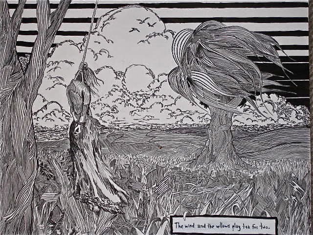
Everybody loves mountains:


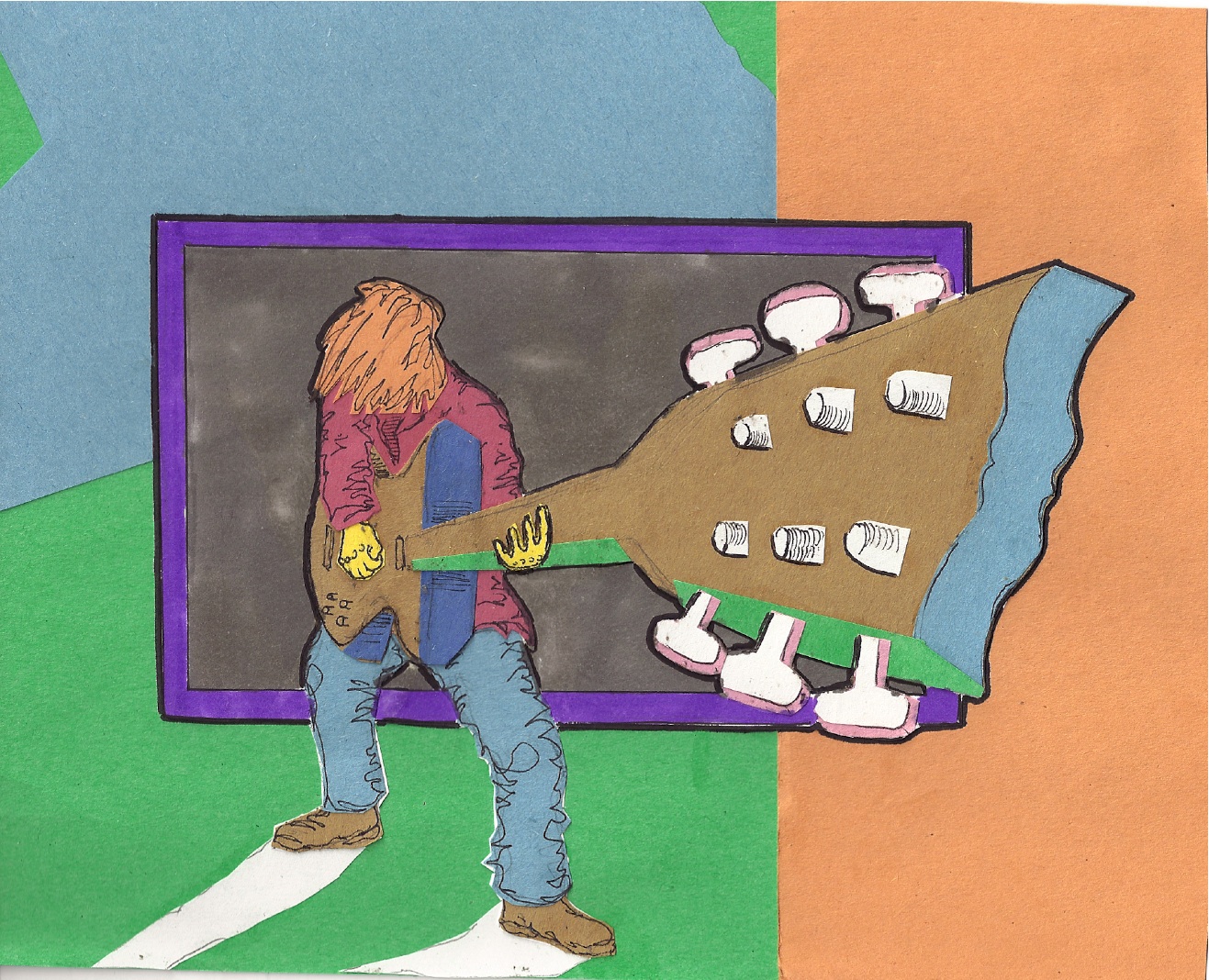
Second from the grab bag:

Awhile back I started drawing Cruella DeVille from the various frame sheets posted on Andreas Deja's awesome animation blog, as a practice exercise. I liked the wild expressions that the origianl animator (Marc Davis) came up with, and so only concentrated on her head and face instead of full body poses. I ended up with so many that I could practically read dialog from her mouth as she thrashed back and forth, hair and bangs whipping as she cackles and snarls. And so, in the early morning I was motivated to animate my own sequence, borrowing some of the expressions.

I decided to start with something relatively easy (the Cruella heads and faces), compared to the other ambitious projects I had in mind. I'll tackle those after I struggle through some initial shorter, relatively simpler sequences to become familiar with the mechanics of making a cartoon. Voila my pencil test (scroll down). The original idea was to have a woman huffing and puffing and screaming at her cats. I got through that sequence pretty quickly (and roughly) and thought next about what I could add to it; hence the cat-thrashing and strangling. I don't intend to make this too much longer, as there is no real plot to speak of.

One common thing people write in animation books and on the blogs about pencil tests is that they aren't about producing the final clean, perfect drawings. They're important to get a rough approximation of how the movement in the animated sequence flows. Does it look believable? Do drawings need to be added or subtracted to make the motion work? Then once you've decided that the sequence works, you go back and clean up all the mess and keep the final lines. It is painfully obvious to me that my pencil test will need lots of work to make a "final" product.


Admittedly, I didn't take as much care as I could have to keep the character on model, as they say. Throughout the sequence here her head balloons up, her arms stretch, the dimensions of her face change. But overall I'm happy to have done it, considering I'm teaching myself everything. Also, I am using a hand-held digital camera to capture the images, which explains the shaky aspect to the video. Until I meet my goal of "completing" a cartoon short, I'm withholding from buying a scanner. As I posted before, I use ImageJ (a program provided free by the National Institute of Health) to assemble the drawings into a Quicktime movie. Someday I'll explain step by step how to do that so people who otherwise wouldn't make cartoons (no animation software) can learn how to do it relatively easily.

Wednesday, November 9, 2011

Hooray for Japanese pens!


I just ordered some more of the Deleter G nibs and Maru nibs, which are both incredibly fun to draw with. Hopefully I'll be able to afford a scanner soon.

Saturday, November 5, 2011

Grab bag


Late nite pen and ink has been the name of the game recently. I finally settled into the upstairs of a duplex and set up shop. Thanks to kind friends I have tons of desk space for both illustrating and animating. The pages in my sketchbook are filling by the day, sometimes labored and other times more easily.

My main focus as I pieced together my apartment and tried to find work was larger pen and ink drawings. The original idea was to use lyrics that practically begged me to think of something to draw for them and draw it. While taken completely out of context and influenced by Bernie Wrightson's work on Frankenstein, I used "the wind and the willows play tea for two" for this one:


One of the drawings I'm working on now (shown at the top of the post), however, was not influenced by any lyric but only an awesome photo of a friend's baby. Hopefully I'll get the lighting right.

I've been pushing to fill up my sketchbook quickly. And although I haven't been close to meeting my ambitious deadlines, the book has been good so far (to me). One effort made is to draw more of what I see, which many people agree to as being an essential skill; a difficult but essential skill. I've also been tightening my loose grasp on perspective drawing. In the case below I didn't concern myself with staff and customers around the register.


I even got in some landscapes while in-between climbs in Utah this fall, drawn with a trusty, tried and true Bic pen. If anyone as ever been to Indian Creek, these were drawn while sitting at Middle Crack (5.12), at Reservoir Wall.


Another focus has been drawing/coming up with characters, and drawing them as reproducibly as possible in different poses and gestures. Exact reproduction is lacking, but on my radar.


Here are some atypical characters. (Atypical in the sense that I usually draw bald men).


Here's a fun one from the notebook.


However, I have animation on the mind. This is an adventure a little more intimidating to begin and therefore easier to delay. Luckily I have the space and basic equipment necessary to commence production when I can wrap my mind around the project. My first landmark is getting out the first 5 seconds in the form of a pencil test. Once I start and obsess and animation becomes a compulsion that demands insomnia, 5 seconds will become 10 and then after many lost hours of sleep my 10 seconds all of a sudden become minutes, I anticipate that I'll have a decent second effort (first effort). I just need to start.

Anyway, here are some random pictures to finish up my road trip. First off, the rainy Olympic Mountains and the Queets River.


Orcas Island:


Failed attempt on Enchantment Peak:


Indian Creek:


Tuesday, September 13, 2011

First Pages from a New Sketchbook

All these drawings are scanned from book #2. Enjoy!

Nib = removable/interchangeable dip pen tip. Used for illustration and calligraphy.


Sometime awhile back I wandered into the Seattle Comicon to talk to artists about equipment and techniques. I had a long conversation with Joe Weems, about whom there is very little information on the internet. He told me that if you care about your drawings and your work you'll only use dip pens.


(the kickass G Pen)

(Maru Pen)


(Hunt 56)

I've been drawing since I was young, copying my brother (who is now a screenwriter in LA). But, as I mentioned many posts back, only these past two years have I become somewhat focused. After 11 months I finally filled up my first ever sketchbook (from which you can see random drawings in previous posts). When younger I typically drew on loose pieces of paper and scraps. Recently I bought a slightly bigger second sketch book and have been working steadily through that. I've been trying to develop further dexterity with quill style pens and black ink.

I initially started using Hunt nibs; predominately 56 (crow quill) and 102 (the smaller equivalent). I only really started with this style in order to try something new; I didn't really know anything about them. Yet I never felt natural drawing with them, however fun they were to use. Thus I relied on the Micron pens to take care of serious business and any sort of sketching. These reminded me of a "professional" bic ballpoint pen. I used to ONLY draw with bic pens when I was in grade school, middle school and high school. The 001 Micron felt natural to me, but I rip through those pens too quickly to be able to afford them; the tiny tips were good for tight parallel lines but too fragile to withstand the pressure with which I draw. For fun I started using the ultra-flexi nibs 99 in some figure drawing sessions and it seemed to be more of a natural loose sketching style, which was motivating. Trouble is I don't naturally draw in loose strokes. I have a heavy hand (which Paul says might catch up with me later).


(Hunt 56)

(Micron 001)

(Hunt 56)

In an effort to avoid constantly changing nibs (which is annoying), I scoured antique stores on the west coast for calligraphy pen handles into which you can insert the nibs and I found two. I was looking for the classic variety that has the cork grip, not like the shitty plastic black Speedball one (although I use the small brown plastic Speedball handle with the 102, and I added a rubber grip to make it a little easier to hold onto for hours at a time (I'd like to get an antique wood handle)).

(Micron 001)

(Hunt 100)

I've admired the pen work of Goseki Kojima, the Japanese illustrator who drew for the Lone Wolf and Cub series. It's amazing stuff with a lot of motion in the badass sword scenes. One thing led to another stepping into the vast internet ocean and I came across common Japanese illustration equipment. I ordered two Japanese handles and some Japanese pen nibs. They finally arrived from Japan and I tried them out not really expecting to notice any difference but I was completely blown away. The G pen especially is amazing. It's the perfect balance for the pressure with which I draw and sketchability/spontaneity. I want to order 10 more. The Maru pen is the smaller equivalent for super tight lines, but the G Pen should be good for most stuff.

I guess the point is that the Japanese know their shit. American nibs are too delicate, too sensitive. I ordered a Deleter free pen holder and the Tachikawa T-40. Both of these "free penholdes" can fit the bigger G Pen as well as the tube style, smaller Maru pen. They'll also take the bigger American Hunt nibs (56, 99, 512) but don't hold the tube nibs tight (102, 107, 108), so it looks like I have to hold onto the shitty Speedball handle...but at the same time these newe Japanese pens feel so good that I don't think I'll be turning back to Hunt anytime soon, except maybe to continue playing with the ultra flexi 99 nib.


(the packaging from one of the new handles)


**Here is an interesting article/interview conducted by Frank Miller with Kazuo Koike (author of Lone Wolf and Cub) and Goseki Kojima (illustrator).

**Check out Audrey Kawasaki's website and blog. Her paintings and drawings are amazing.

Tuesday, September 6, 2011

Construction Paper and Animation

I made these last night from some colored construction paper, pen, and a few markers. I don't have access to a larger format scanner to capture the entire first image. Perhaps a future investment once I start paying rent somewhere again.


About a year ago, while working in the lab, I made this simple animation (below) in the wee morning hours before bed. I have a bigger story in mind, but these 20 seconds were the preliminary attempt to see whether or not I could actually do it (animate); 100% hand drawn and colored. I used free software available through the National Institute of Health to assemble each individual drawing (12/second) into a stack that can be played as a digital flip-book, in a sense. (In the lab we used the program to assemble time-lapse snapshots of developing fruit fly embryos into movies). In the near future I hope to put in a strong effort to make a few cartoon shorts. I like the format of Looney Tunes and the grotesque aspects of Ren and Stimpy. We'll see how it plays out. First things first I need to streamline the process, draw more efficiently, and figure out the wonders of PhotoShop in terms of coloring hundreds (hopefully thousands) of images.

So what you first see here is a hairball bouncing across the screen. I want to animate a sequence to appear before this of a cat who hacks up the hairball. After the "dripping faucet bird" (my idea of showing he's dumb) I will eventually have a bird hunting scene, whereby a short fat bald man hunts these birds from inside of a mechanized bird suit, driving it like a construction crane. Eventually he kills a bird with a cowboy gun and the other birds freak out and peck him to death.


As this production process continues hopefully I'll be a little more professionnel and post character designs, storyboard thumbnails and all that other good stuff I see animators posting on their blogs (which if you haven't noticed, can be accessed through the links on the right not dealing with music or climbing. Pencil Test is a good one. It shows the rough pencil sketches of classic Disney, as well as other independent animations before they are cleaned up, inked, and colored) to track how the animation develops. I have ideas for three ~2 minute cartoons, so I'll probably be working on these in a fractured and stop-start sort of fashion, but that's ok.

Enjoy!

Saturday, May 14, 2011

Saturday, April 30, 2011

Consistency

If there is anything consistent about this blog, which you'll notice by browsing the archives, is that I often change the focus. In the last month I've moved out of my apartment and have been sleeping in my truck in Utah. Sooner or later, when I'm not using the 15 free internet minutes at the library, I'll post some pictures of red sandstone. Probably by the time I get those pictures up I'll have some of Yosemite granite too.

Hope all is well, sorry for the lack of music.